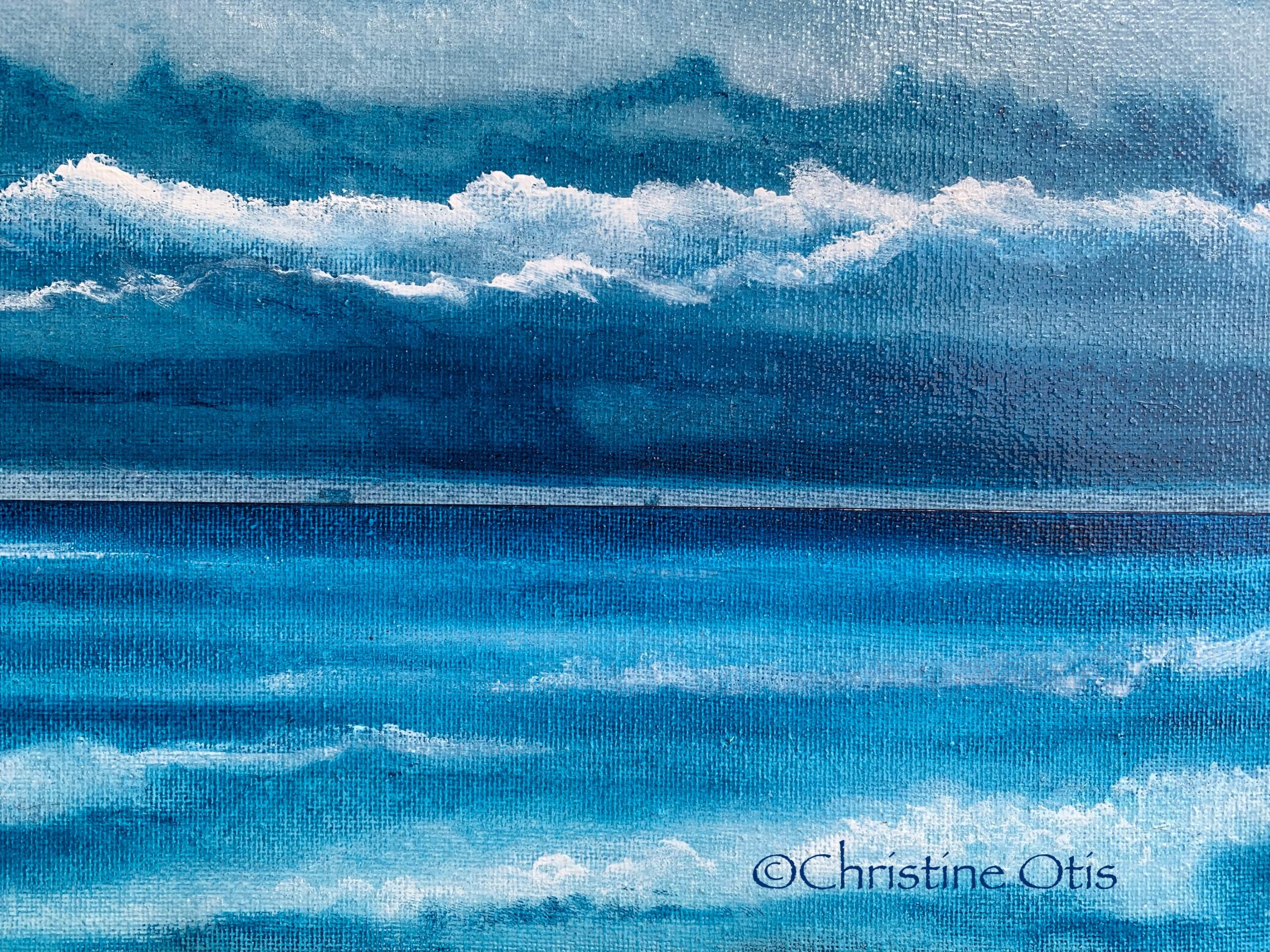

I created this painting using both acrylic paint and acrylic ink. I pushed the paints using my palms, the sides of my palms, my fingers, the sides of my fingers, and part of my arms. I worked efficiently as acrylic ink is fluid and there is a time limit in which it can be manipulated and controlled. I pushed, swiped and slid the acrylic ink, and pushed, smoothed and blended the acrylic paint, combining the two mediums to compliment the other. Sometimes the white acrylic paint was applied over the acrylic ink. Special care is needed when applying acrylic paint over a wet or semi-wet acrylic ink as it can slide over the ink, thus causing the color not to adhere to the canvas.
I wanted to emphasize the cloud cover shown in different bands that often appear during stormy weather, and I wanted a layer of clouds that emphasizes a storm sitting above the water with rain and ships in the distance.